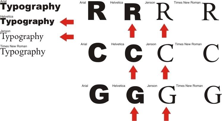
I'm getting worried when designers, sign shop owners, only use these bland routine typefaces. Times New Roman isn't horrible its just that there is so many other choices out there for more honorable serif typefaces. Jenson is only one of many great serif faces to choose from, but you can't go wrong with it. Designed by Nicolas Jenson in 1470, Jenson has been around for a while and has sustained the test of time to be one of the industries most widely used serif faces.
Arial on the other hand is complete crap! I've always hated it even before I was a designer. I just found that it was even cooler to hate it when I became a designer! Arial really does mimic and wanna be Max Meidinger's Helvetica. Helvetica has a love/hate relationship with today's designers I just happen to be one that loves it. Designed in 1957 it is considered a neo-grotesque typeface. Grotesques are known for their stagnant appearance and serious tone, due to very little of not no stroke contrast. Helvetica most definitely fits that category.
I just don't get how designers (not regular people) choose faces like Times New Roman and Arial to do sold work. When they could go the extra mile, pay the extra buck and get some good typefaces for outstanding work for our public to see.
click to enlarge
No comments:
Post a Comment